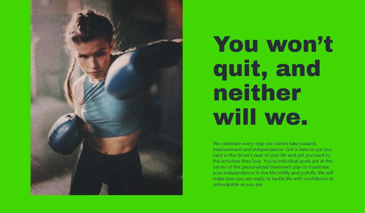
Grit Adaptive Fitness provides physical therapy and coaching for those living with or recovering from neurological conditions or injuries in Portland, OR.
Prompt
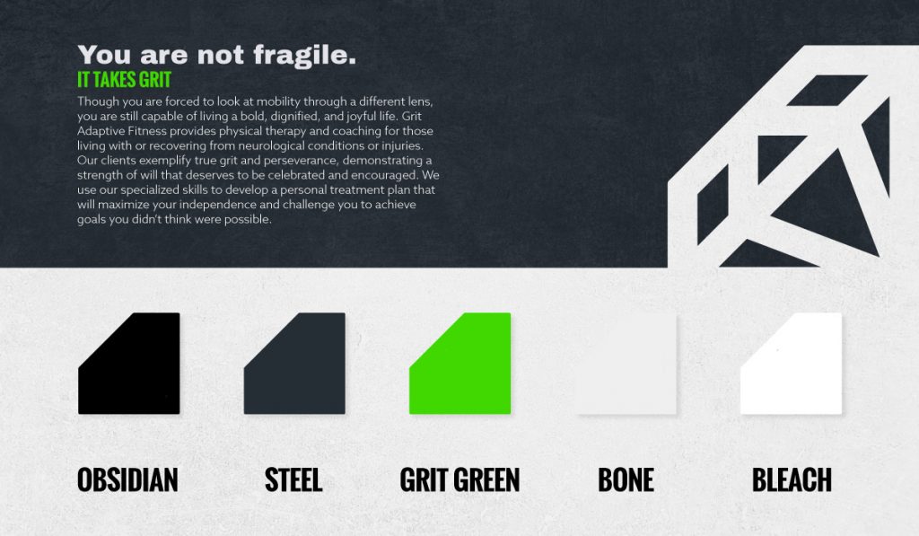
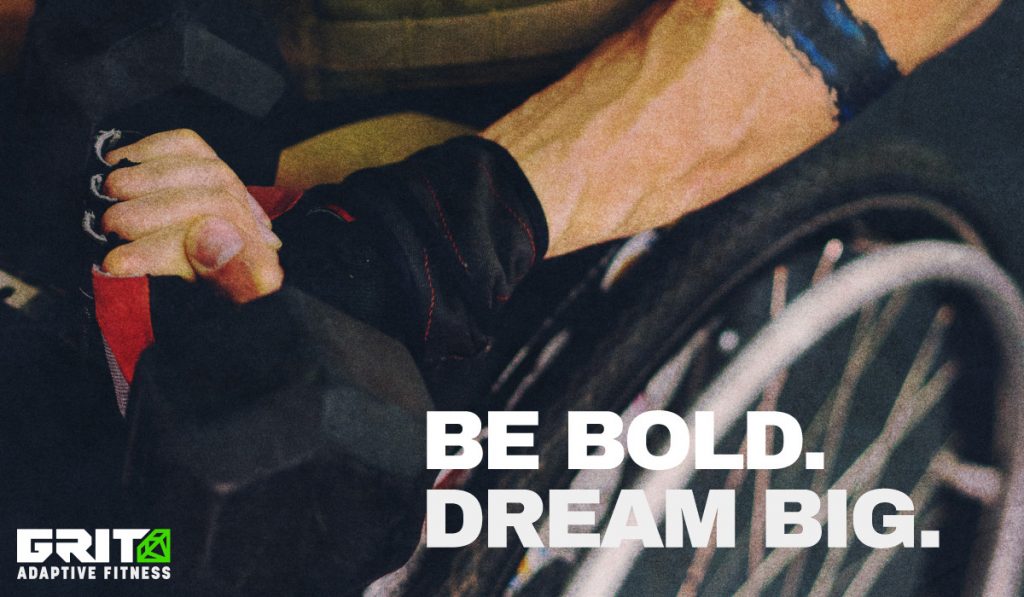
“Our clients exemplify true grit and perseverance, demonstrating a strength of will that deserves to be celebrated and encouraged. We use our specialized skills to develop a personalized treatment plan that will maximize your independence and challenge you to achieve goals you didn’t think were possible. You are not fragile. Even though you are forced to look at mobility through a different lens, you are still capable of living a bold, dignified, and joyful life.”
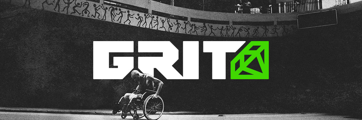
Logo
The logo itself was entirely created in Illustrator. I chose to round the corners for a more approachable feel, and most spacing and angles are consistent. The diamond icon–signifying the shaping through adversity–came about organically, completing the shape of the wordmark.
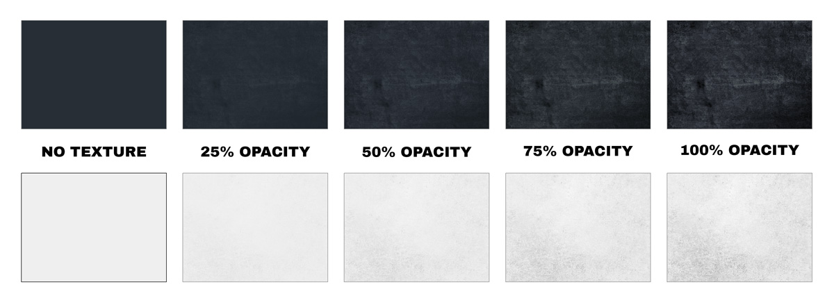
Textures
A unique aspect of this brand is the “gritty” textures.” I created high resolution textures to match the color of “Steel” and “Bone” which could then be layered above at different opacities depending on how much text readability was necessary.